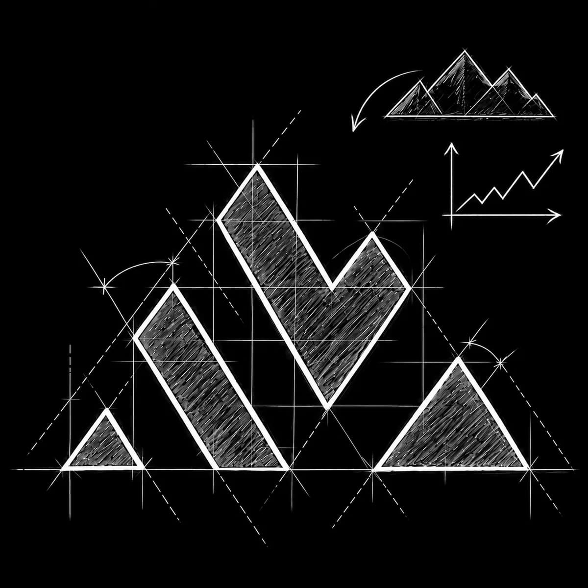
The mark
We wanted something modern with a bit of meaning behind it. So the mark folds two ideas into one shape: a mountain range for the name, and the rising line of a financial chart for the work. One triangle, repeated, does both.
A corporate brand and website for an investor relations firm that owns the publications its investors read.



Snowbridge Markets is an investor relations and corporate communications firm. It works with capital-raising companies across North America, the UK, Europe and the Gulf. It owns its own financial media platforms (built by us): BörsenBlick, a German-language news site, MarketFlick, its English-language counterpart, and Mine&Mineral, a brand new minerals title launching this autumn.
Snowbridge Markets is a longstanding client, and we have built several of its platforms together over the years. This site is the firm's own front door. It was a real pleasure to work with the team on this one.
We had a clean slate. We started with the brand: a logo mark, a colour system and a type pairing, all brought together in a set of guidelines for their comms and marketing materials. We designed and built the site on that system, wrote the research that shaped its argument, and produced the short hero film that opens it.
The site went live in August 2026 at snowbridgemarkets.com. The brand now runs across the firm's decks, platforms, research papers and analysis.
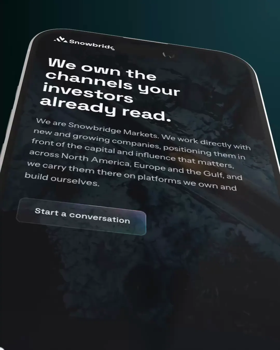

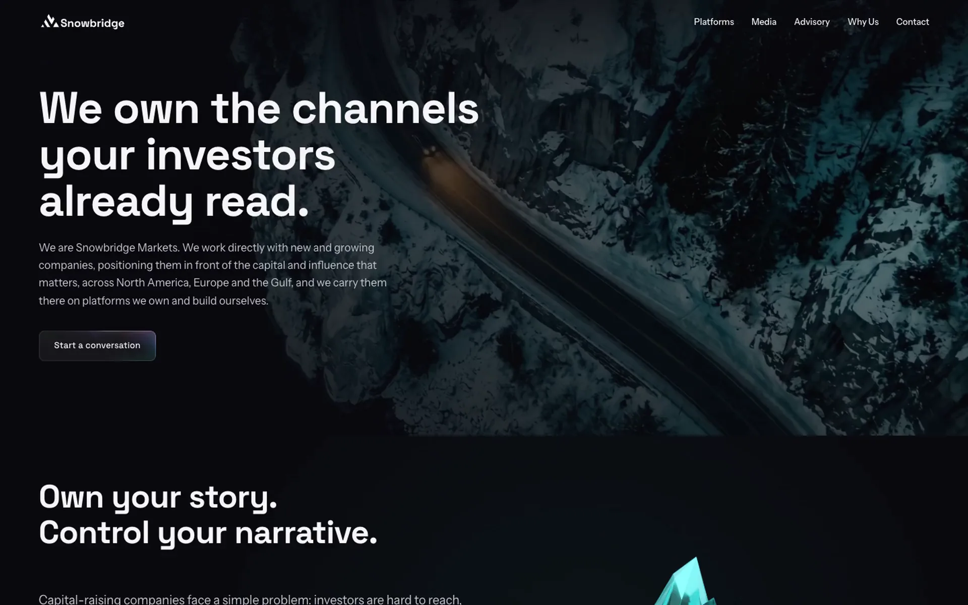
One dark ground, one teal, two typefaces, and a set of glass surfaces. Every Snowbridge property draws on the same guidelines, so a deck, a magazine title, and the site all read as one firm.
We wanted something modern with a bit of meaning behind it. So the mark folds two ideas into one shape: a mountain range for the name, and the rising line of a financial chart for the work. One triangle, repeated, does both.
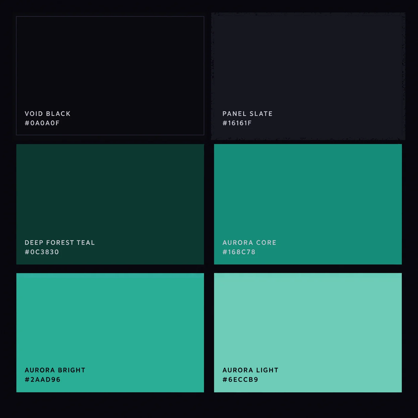
Void black as the ground, and aurora teal for every accent, action, and highlight. Purple appears only as atmosphere at the edge of a gradient, never as a button.
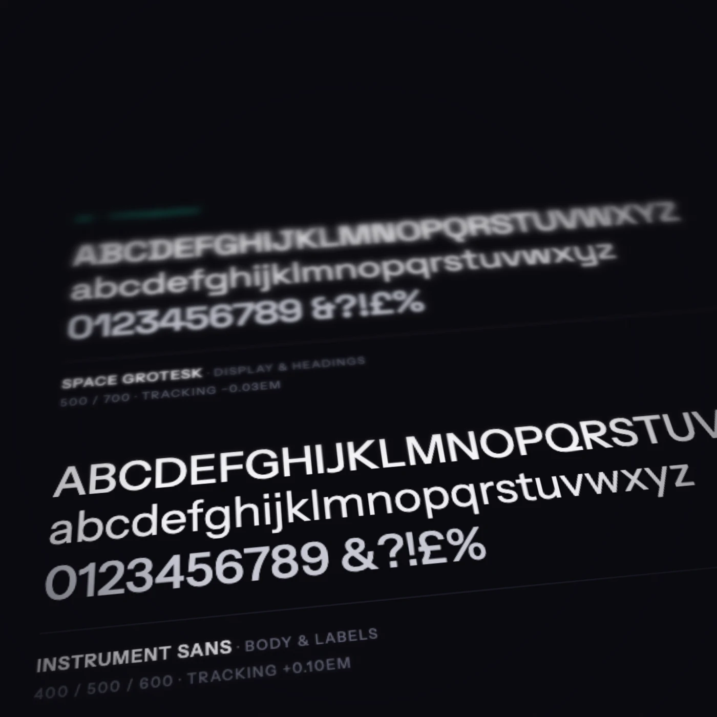
Space Grotesk, set tight, for headings and figures, and Instrument Sans, set loose in small caps, for labels and body copy. Big type pulls in and small type spreads out.
The reach figures sit on layered mountain ranges drawn as chart lines. On scroll the front ridge draws itself in and the four figures count up along it.
Client's own figures, August 2026.
The services drawn as isometric diagrams, all in vector so they stay crisp and take the theme. Here, a site taken apart and rebuilt: dense pages and a wall of text feed one clear page, and structured landing pages fall away to the right.
We have worked with Studio Brio on some complex strategy, design and AI projects, and we are very happy with the return on our investment.
 Jan Kellett